Tools to monitor PV hybrid system performance

A hybrid energy system is a combination of two or more energy sources that work together to produce electricity. In the case of PV hybrid systems, solar energy is combined with one or more other energy sources, such as diesel generators, batteries, or wind turbines. The main objectives of PV hybrid systems are to increase the reliability and efficiency of electricity generation, reduce energy costs and minimize the environmental impact of energy production.
To assess whether PV hybrid systems are achieving these objectives, system data must be monitored and analysed. The data sets are typically big and complex but can be analysed within a short period of time with the help of suitable visualisation tools. A report by IEA-PVPS Task 18 defines an easy-to-use, standardized data visualisation for PV hybrid systems.
The method permits a fast review of the performance of the systems in order to gauge success or shortfalls of the optimisation regime or to compare the performance of various systems in a fleet. This standardization and the possibility to compare systems allows for the identification of weak points of the operating and management strategy of single systems. This enables the operators to improve the efficiency of the systems.
The data visualisation focuses on the battery data as this is the most cost-intensive component in any PV hybrid system. To optimize the use of the battery and to increase the lifetime of the battery is always key in order to reduce the overall operating costs of PV hybrid systems. To realise the proposed data visualisation, it is necessary to monitor various battery metrics such as voltage, current and temperature. The visualization draws temperature heat maps, temperature profiles and daily energy profiles, as well as other combinatorial metric visualisations, which are necessary to analyse the load and the input sources.
With the help of these figures, it is possible to adjust and adapt several charging and discharging set-points, scheduled generator start and stop points or any other applied management strategy to the real life operation of the specific system. This is often more valuable than pre-planned strategies as in many systems the reality of the usage differs heavily from the planned and scheduled operation.
This article will focus on some specific visualisations for PV hybrid systems to demonstrate their utility. Further information can be found in the report, which goes through various monitoring and visualisation regimes for a range of system types including pico solar, classic solar home systems (50 W to 500 W), inverter based systems (500 W to 5 kW), PV hybrid systems (5 kW to 250 kW) and larger microgrid systems (more than 250 kW).
To analyse the operating strategy of the energy management system for example, it is reasonable to visualise the behaviour of the battery current and state of charge (SOC) depending on the voltage of the battery. To do so, a diagram can be created as shown below. The x-axis represents the normalised battery voltage, while the battery current or SOC is placed on the y-axis. Displaying all data sets results in a dot-cloud.
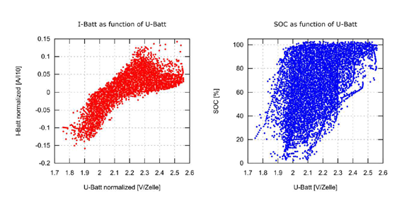
The voltage is displayed as the normalized battery voltage in [V/cell] and represents the x-axis in both dot-cloud diagrams above. The current is normalised by the capacity of the battery in [A/Ah] and reflects the y-axis in the left diagram. In case of a 100Ah battery the rating means that a current of 10A is displayed as 10A/100Ah = 0.1A/Ah in the given example. 5A/100Ah = 0.05A/Ah. Positive values are charging currents while the negative values are discharge currents.
In case of the given example in the left side of the figure (red dots) it can be seen:
- The absolute values of the maximum charge and discharge currents are similar. This indicates a reasonable system sizing as the applied generators including PV can recharge in about the same time in which it was discharged.
- The highest charging and discharging currents can be seen at very low and very high voltages. In the given example, currents that charge and discharge the battery within a short period of time occur quite often.
In case of the given example in the right-hand side of the figure (blue dots) it can be seen:
- The SOC distribution is relatively equally weighted over a cloud within a high voltage and SOC window. The typical battery hysteresis can be seen as the vertical ends of the blue dot cloud. In comparison to a good battery SOC situation the area between these two “lines” is relative wide which provides information about the accuracy of the SOC calculation in the system. In this case the performance is low.
- It can also be seen that often low battery voltages appear in combination with very high SOC ratings. This indicates that high discharge currents appear in the system. This means the chosen battery capacity was rather small in comparison to the applied inverters and results in a short battery autonomy time.
- This type of diagram also allows insight into the remaining battery capacity and its age. If a good SOC algorithm is applied, the width of the SOC window will be small. Within the aging process of the battery the SOC window will be widen increasingly. Also, the density of dots with high SOC rating and low battery voltage increases. At the same time the number of dots with low SOC values and high battery voltages increases.
For an experienced system designer or operator, the insights gleaned from the above data visualisations are obvious and meaningful. A system performing as expected will produce data visualisations that “look” nominal whilst underperforming systems, or systems design inappropriately will appear off-nominal.
Having visualisations that can provide immediate feedback to project stakeholders can help to optimise the system and to make adjustments for future designs. IEA-PVPS Task 18 hopes its report on PV hybrid system data visualisations can help system operators with the optimisation of their systems.
This article is part of a monthly column by the IEA PVPS programme. It was contributed by IEA-PVPS Task 18 – Off-Grid and Edge-of-Grid PV Systems. Further information can be found in Task 18’s recent report: PV-Hybrid System Data Visualisation Recommendations.
By Christopher Martell, GSES, Australia
The views and opinions expressed in this article are the author’s own, and do not necessarily reflect those held by pv magazine.
This content is protected by copyright and may not be reused. If you want to cooperate with us and would like to reuse some of our content, please contact: [email protected].
Please login to comment